Creativity has been a driving force in Bennett Berry’s life since the moment he could pick up a crayon. Visitors touring his art at OKC’s Howell Gallery may prefer his more detailed figurative work or his forays into abstraction, but either way they’ll be struck by his paintings’ palpable energy and his affinity for vibrant color. We spoke with the artist about his international influences, his distinctly Oklahoman inspirations and much more.
When did your interest in art begin?
I’ve been fascinated with art as far back as I can remember. I was maybe four years old — it has to be one of my first memories — and I remember drawing on the butcher-paper table cloth at Garfield’s restaurant. It was a somewhat cubist (however unintentional) Superman. There was also the Picasso coffee table book I remember being in the “toy room.” I’ve never been a huge Picasso fan, though I do appreciate his work, but I’ve always remembered that book. Later on came Quail Creek Elementary and visiting artist Dennis Martin. He came by maybe three times over the course of a year, give or take, but I remember aspects of those visits vividly. We were only in first grade, but the man was teaching us a scaled-down version of a high school-level drawing class involving depth, perspective and other things you’d never guess to teach a first-grade class. I loved it.
Your art draws inspiration from various sources, including architecture, nature and abstract forms. Can you talk a bit about the artistic influences that have shaped your style?
There are a variety of artists that have shaped my style. Van Gogh has always been huge, and to a lesser extent [Edward] Hopper, Jean-Michel Basquiat, Caravaggio and seemingly everyone from Impressionism through to the Fauves (I love the Fauves). There are also the art teachers I’ve had over the years, Steve McConnell at Bishop McGuinness and George Bogdanovitch at Denison University in particular. I don’t know if I’d be painting today if it wasn’t for them.
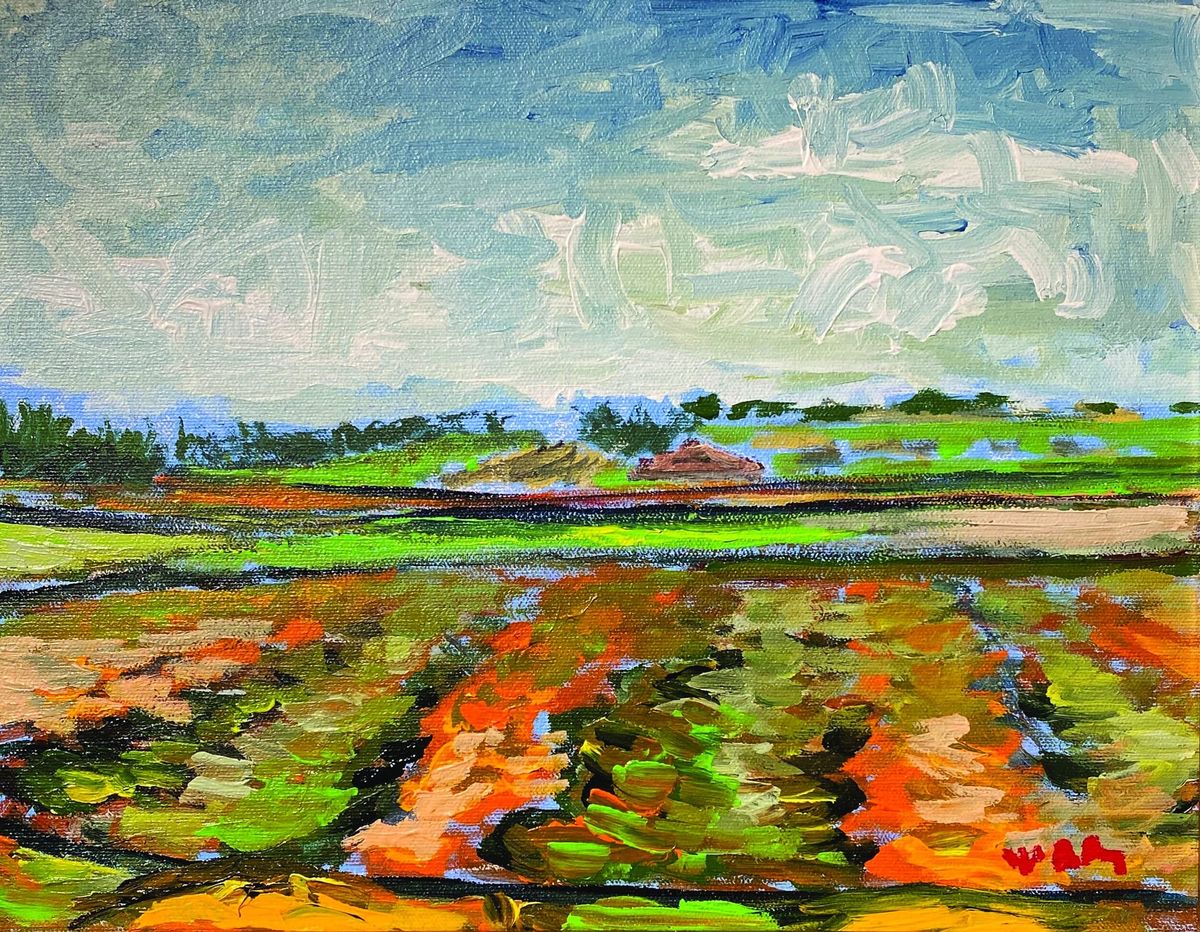
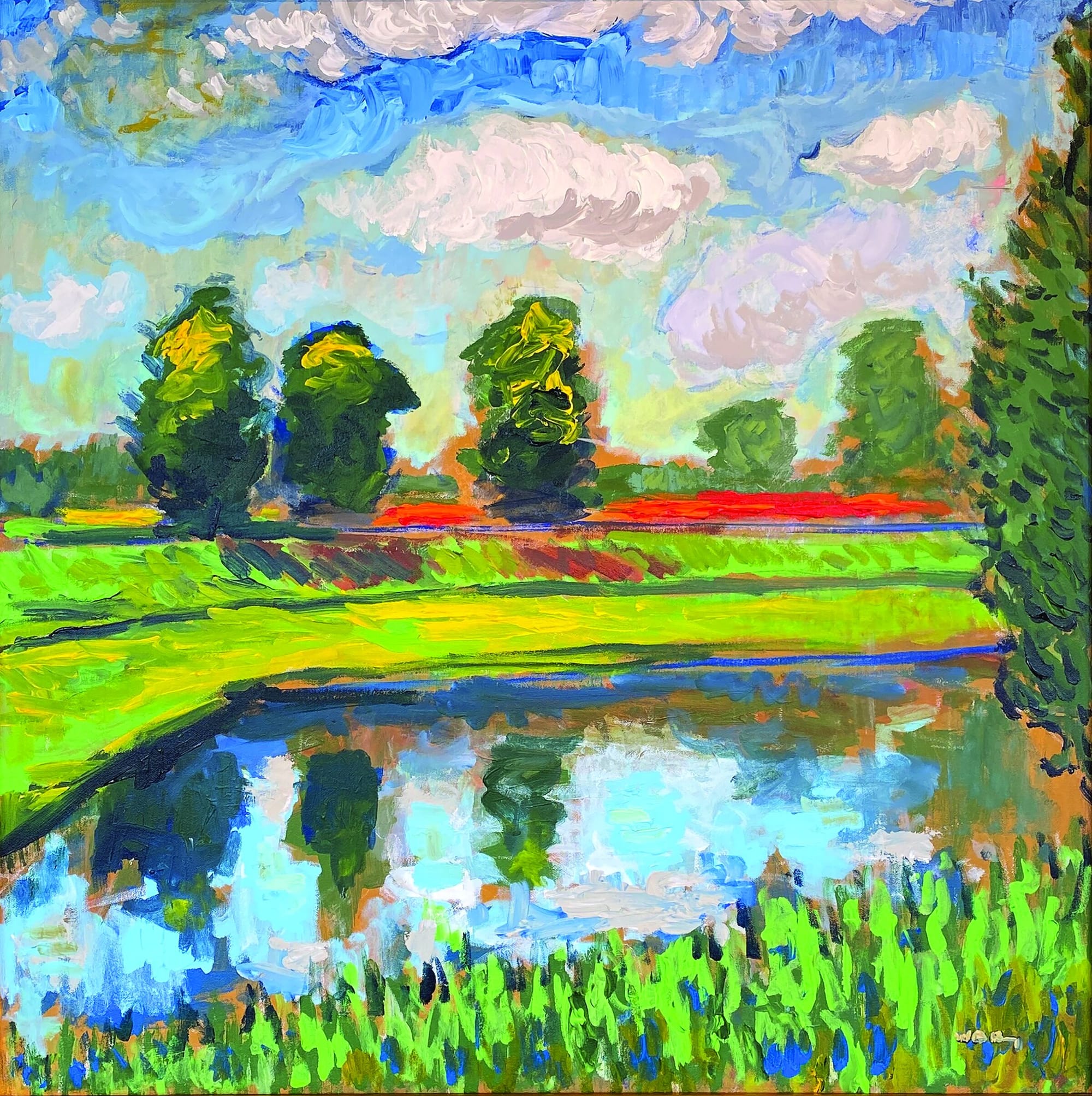
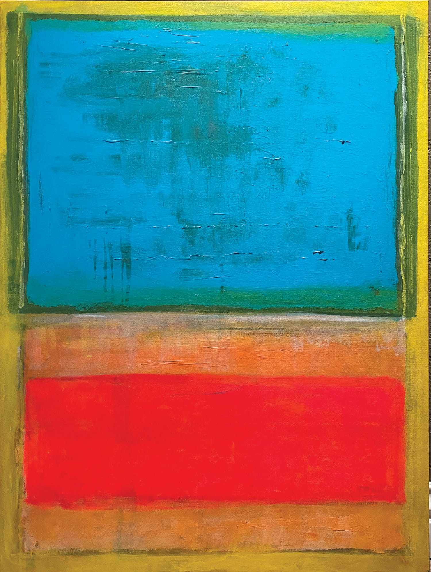
LEFT: “FRENCH LANDSCAPE WITH POND” 30 x 30” acrylic / RIGHT: “BLUE, RED AND YELLOW” 40 x 30” acrylic on canvas
Your work often incorporates bold, bright colors. How do you approach color in your compositions, and what do you hope to convert through your use of color?
I don’t necessarily set out to use color in any kind of narrative or symbolic fashion. Color can be useful for converting a mood, or tone, but I don’t go so far as to give it any kind of symbolic meaning. I want color to have a particular feel to it. For instance, a landscape, to me, can come across as almost “juicy” visually. Lots of strong primary colors and loud variations over a background color that best launches them off the canvas, all the while moving back and forth over one another. On a technical level it can do all sorts of things, with depth and perspective and so on, but mostly I just want it to have impact.
Many of your pieces have a strong sense of movement and flow. How do you create that sense of dynamism in your work?
When everything is going right with a landscape — or with any painting, for that matter — things go quickly. So much so that it tends to spook my dog and she leaves the room. You pace around like a nut, listening to whatever music fits the painting, sometimes for an hour or more, and then something clicks. The palette is set up in a hurry, there’s a lot of jumping around, pacing back and forth, going into the canvas, stepping back, going back in — and within the next 2-3 hours, a painting will be signed and it will be something I’m genuinely pleased with.
You seem to draw inspiration from your travels. Can you share a particularly memorable travel experience that has informed your art in some way?
The easy answer here is Pont Aven, Brittany. There are other travels, Los Angeles and New York in particular, but Pont Aven was the most memorable, and likely the most impactful. Over the summer of 2001, in between my junior and senior years at Denison University, I studied abroad at Pont Aven School of Contemporary Art in Brittany, France. Prior to Pont Aven, I didn’t have a real appreciation for Paul Gauguin or Fauvism (I doubt I’d even heard of Fauvism prior to that), but the use of color and overall aesthetic made an impact. In a more literal way, the influence from the school was great as well.
You’ve been exhibiting your work for several decades. How have you seen the art world evolve during that time, and what changes have you observed in your own work?
To be honest, I haven’t paid as much attention as I should have and should be, but I do sense a greater appreciation locally for art in general. You see murals around town, there’s the Oklahoma Contemporary, and all sorts of new public art. As far as my own work, I’ve been trying to get back to where I was and what I was doing late in grad school and early afterward. Just prior to when I was trying to get super detailed, almost photorealistic. Things were fun and loose. Nothing against the other work, I love it and it has its many merits, but I miss the looseness and, if I’m being honest, I probably miss being in grad school. I wasn’t overly concerned with the accuracy of a draft or drawing, but rather the quality of the painting. It’s easier to get that sense of flow, the immediacy, that I was talking about earlier when you’re painting like that. It’s an odd thing to say, but it’s a more emotional way of painting, and it can come through on the canvas if everything goes right. That’s where I was, then came the figurative pieces and cityscapes (which I still love and will likely revisit), and now I’m trying to get back to that time in the early aughts. •
The link has been copied!
Your link has expired. Please request a new one.
Your link has expired. Please request a new one.
Your link has expired. Please request a new one.
Great! You've successfully signed up.
Great! You've successfully signed up.
Welcome back! You've successfully signed in.
Success! You now have access to additional content.